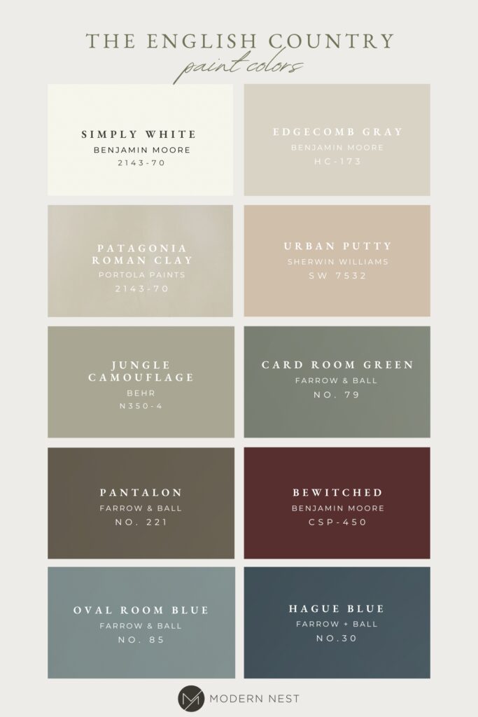
Our team has received several questions regarding the paint colors at the English Country Home, and we thought sharing them all in one place would be a good reference tool for you, because we know when it comes to choosing paint colors, the possibilities are endless. Before you get lost searching through hundreds of swatches, keep scrolling to discover our tried and true paint colors from the English Country Home that are full of rich, deep hues and warm creamy neutrals.
Exterior Door
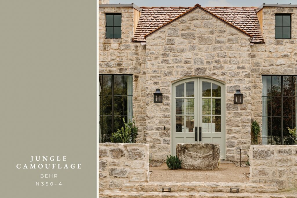
Jungle Camouflage by Behr is a beautiful and versatile color that works well with a variety of architectural styles. It is a sophisticated and timeless neutral green, that adds a touch of elegance to any home. This makes it an ideal choice for a front door color – as it is both welcoming and charming, leaving a lasting first impression on guests and passersby alike.
Main Interior Walls
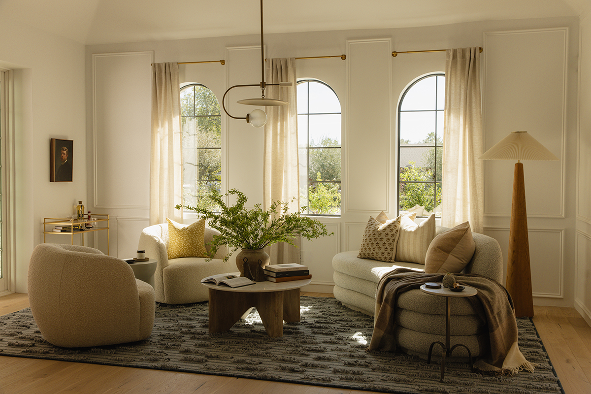
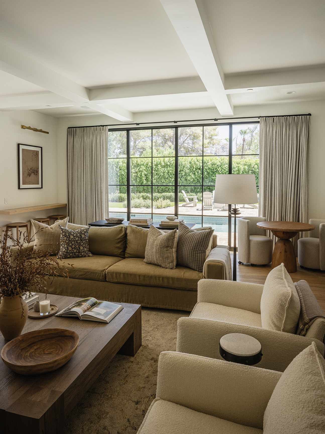
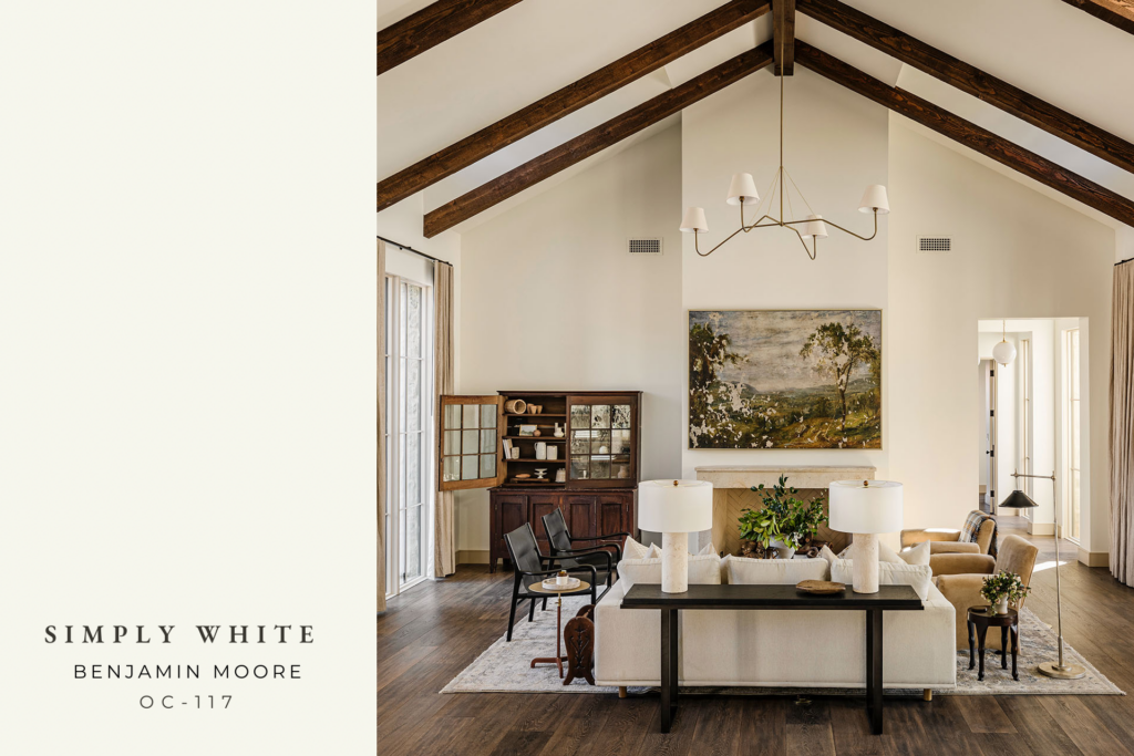
The main interior walls of the English Country Home are painted in Simply White by Benjamin Moore. This versatile shade of white offers a crisp, clean look that is both bright and inviting. The subtle hint of warmth creates a creamy backdrop that softens any room and serves as the perfect backdrop for your home. We love how it allowed the furnishings and architectural elements such as the reclaimed limestone fireplace and dark wood tones, to shine.
Doors + Baseboards
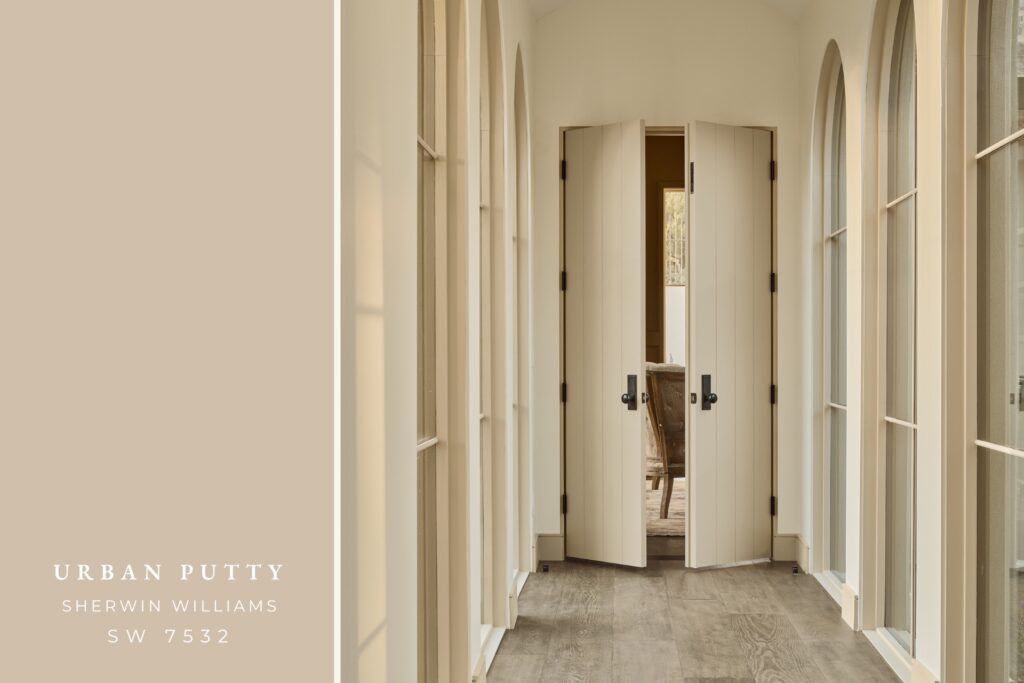
The use of Urban Putty by Sherwin Williams for the interior doors and baseboards throughout the English Country home adds a modern touch. This warm beige color has subtle green-gray undertones that make it a beautiful and unique contrast to the white walls, adding both depth and visual interest to the home.
Kitchen Hutch
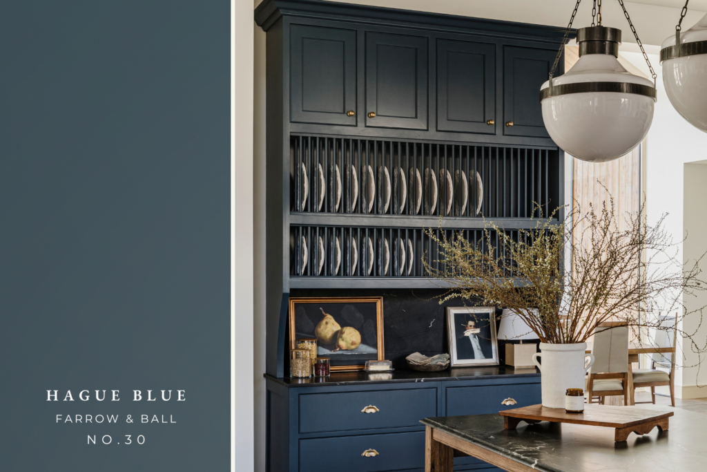
The deep and dramatic Hague Blue by Farrow & Ball was carefully selected to add a pop of color to the custom built-in hutch in the English Country Kitchen. This bold color exudes timeless appeal and sophistication, creating a beautifully rich focal point in the space.
Kitchen Cabinets
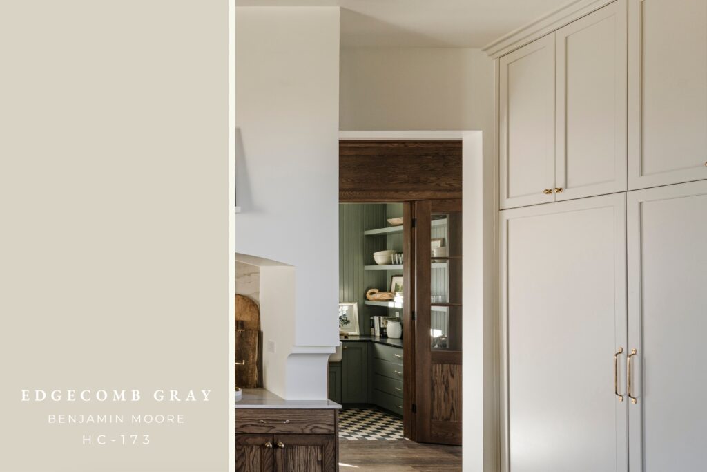
The kitchen cabinetry was painted in the color Edgecomb Gray by Benjamin Moore. This go-to neutral refreshes any space, while providing a warm, welcoming feeling. Adding this subtle tone to the cabinetry really added so much richness to the space, and pairs beautifully with the Simply White wall color.
Butler’s Pantry
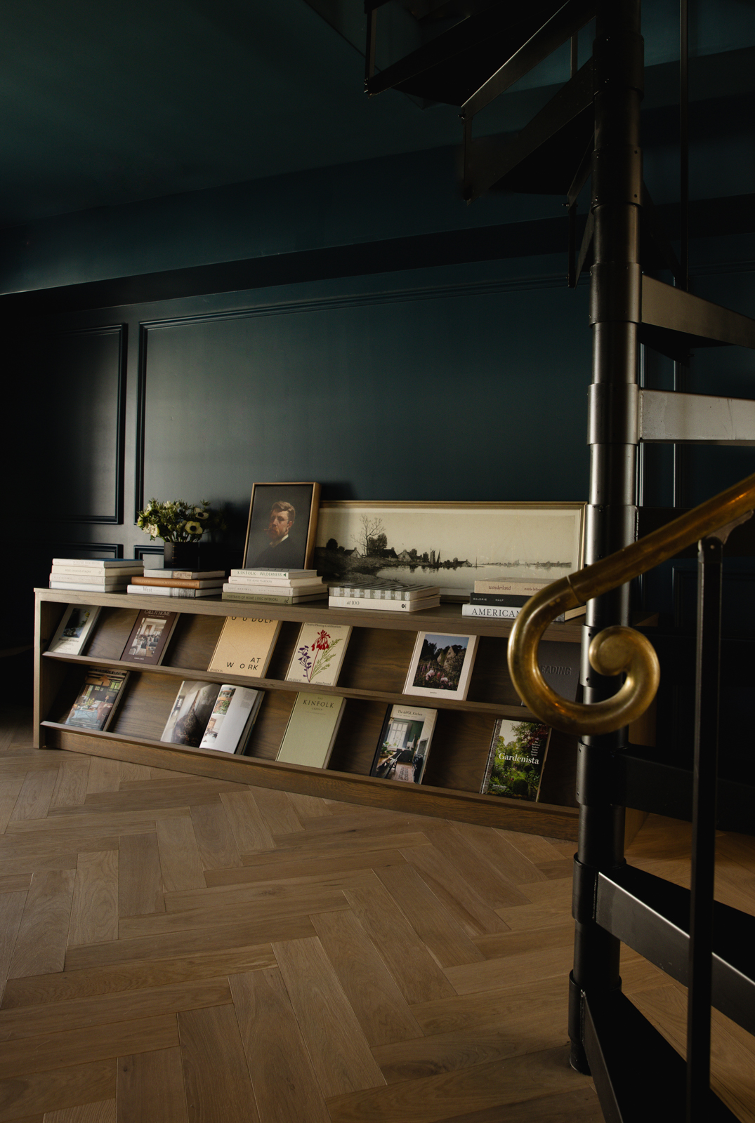
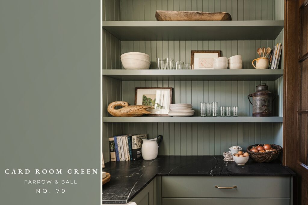
The Butler’s Pantry was painted in the sophisticated dark grey-green color, Card Room Green by Farrow & Ball. Unapologetic in its strength, this bold color choice brings a room to life with its depth, charm and distinction. The tone on tone application created a modern and dramatic affect to this stunning Butler’s Pantry space.
Mud Room
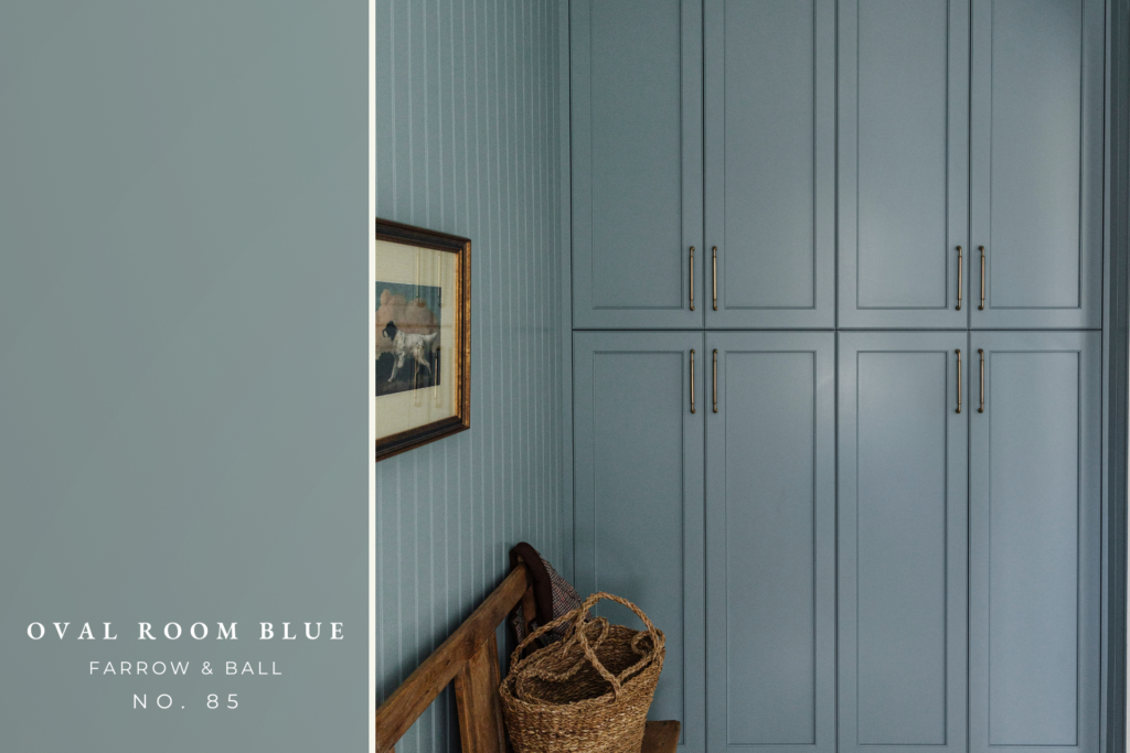
In this elegant English Country Mud Room, the Designers have chosen to create a sense of depth and balance by utilizing the stunning shade of Oval Room Blue by Farrow & Ball. This dark and historic blue color has a subtly aged feel that adds a touch of moodiness to the space. The use of the tone on tone application creates a cohesive look between the walls and cabinetry, adding to the overall aesthetic appeal of the room.
Bath
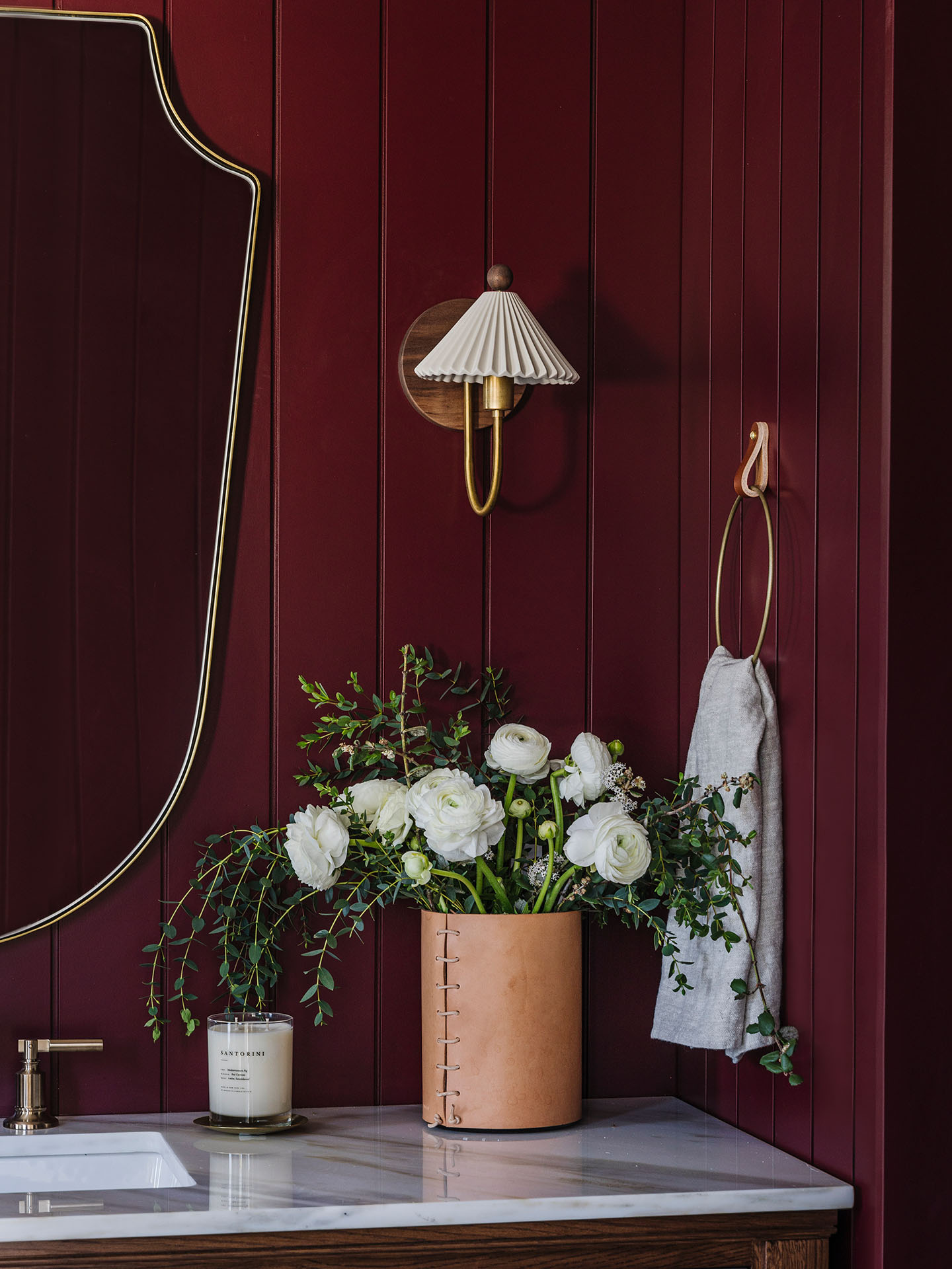
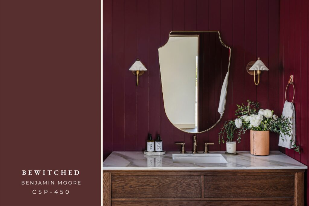
This bathroom space was painted in the bold color, Bewitched by Benjamin Moore. A fluid oxblood red, it is beguiling in the depth of its tint. This dramatic color choice on the wood wall paneling detail added so much visual interest and richness to this bathroom space.
Office + Powder Bath
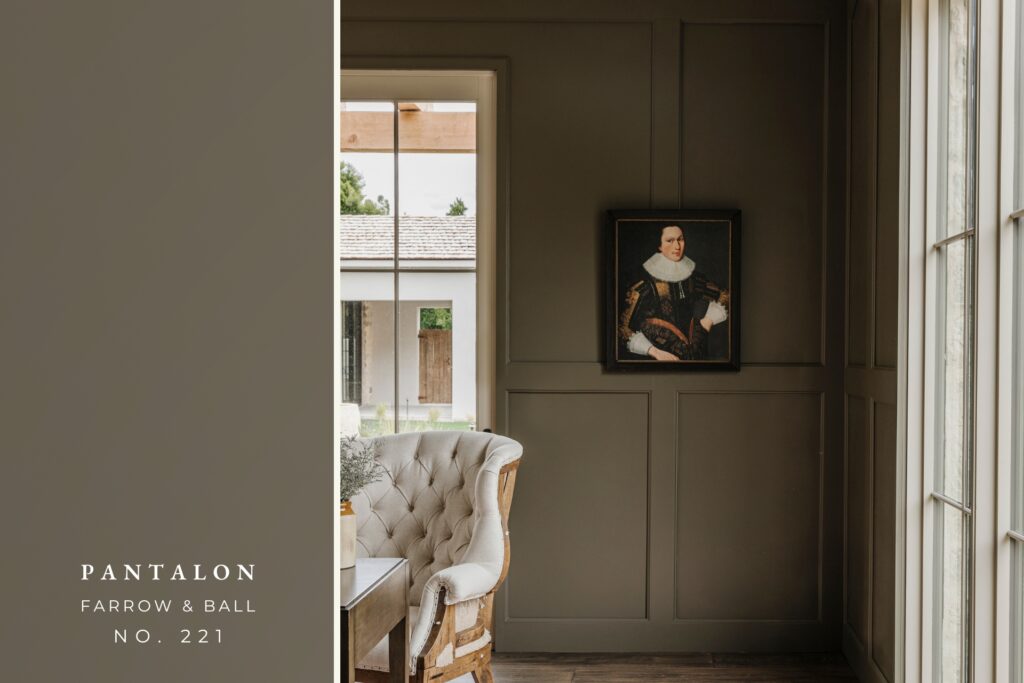
The English Country Office and Powder Bath feature Pantalon by Farrow & Ball. This modern color with traditional character is neither brown nor green. This mysterious tone changes color in different light conditions, making it a particularly captivating shade. We love the moody drama it invokes in these spaces.
Primary Bath
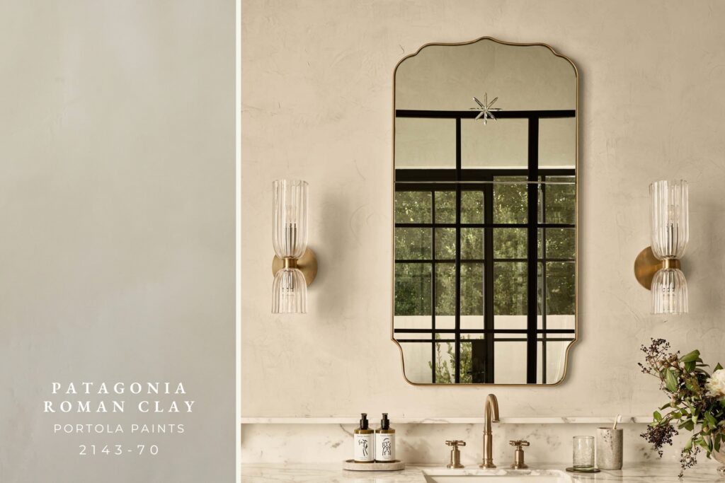
The Primary Bath is painted in the gorgeous color Patagonia by Portola Paints, in a Roman Clay finish. The beauty of this specialty paint is its ability to add texture and movement to any space, with its subtle variations in tones and depths. The Patagonia paint color is a sandy beige/off-white tone, that adds so much warmth and richness, elevating the overall style of this space.
The Paint Color Cheat Sheet
